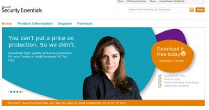
This is more of a rant than anything, so bear with me. Microsoft recently overhauled their Microsoft Security Essentials website. And normally a website redesign is nothing more than a small part of a larger marketing campaign to refresh a brand identity, but in this case, I think Microsoft dropped the ball. You can’t just make a radical sweeping visual change to your anti-virus software website at the drop of a hat. With the amount of phishing websites out there, and browser hijacks which redirect unsuspecting Internet surfers to illegitimate versions of trusted websites, I find it astounding, and appalling that Microsoft would completely overhaul their Microsoft Security Essentials website without any notice whatsoever. In fact, Microsoft should be even more wary of massive branding changes especially in light of recent rouge versions of MSE which looked very much like the genuine article.Â
I am not sure exactly when Microsoft made the change, but here is what the Microsoft Security Essentials website looked like in February 2011.
And here is what their website looks like now, at least as of March 30, 2011.
In fact, Brandon called me to verify that the MSE website was legit, and that the computer he was working on wasn’t still infected and redirecting the browser to a phishing site.
I suppose in the grand scheme of things, this change really isn’t a big deal. The problem I see is that Microsoft so far has done an excellent job with Microsoft Security Essentials. It is a fast, lightweight, accurate and free anti-virus software, which is, or at least was well on its way to building a strong identity and reputation of trust. Part of building that user trust is an easily recognizable brand, which can be easily identifiable as genuine. Understandably we visit this website significantly more than the average user, so while the change was drastic to us, it may not be to the average user.
This is not to say that other anti-virus software companies don’t ever update their websites. Symantec, McAfee, ESET, AVG, etc, have all gone through their various website refreshes. The difference is that those websites kept some sort of theme constant to their core brand, whether it be the color scheme, typeface, or logo. In the case of the MSE rebrand, there is nothing similar to the old site, save for the typical Microsoft pictures of people looking like their are enjoying the Microsoft product.
This rant of a post shouldn’t take away from the fact that MSE really is a good anti-virus software. We use it on a regular basis, and so far has served us well. And again, despite my strong feelings about this redesign, in the grand scheme of things, this brand refresh is just a small hiccup for an otherwise successful Microsoft product.


